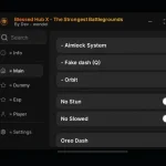
99 Ночей в Лесу Скрипт на Роблокс для телефона и ПК [Авто Фарм Алмазов]
19.09.25 51 588 просмотров
Привет, фанаты Roblox! Ищешь рабочий и бесплатный скрипт для 99 Ночей в Лесу на ...

Typography is a key aspect of graphic design, determining visual perception and effective communication. In this article, we will look at the importance of typography in graphic design and its role in creating attractive and functional design solutions.
We also highly recommend reading our article about graphic design trends in 2024.
Typography is the art of text design, which includes the choice of fonts, their sizes, spacing, alignment and other parameters that affect the visual perception of the text.
There is a slight difference between a font and a typeface. A font is a special variant of a typeface that includes characteristics such as weight (bold, regular), style (italic) and size. A typeface is a general family of designs that includes all its variations.
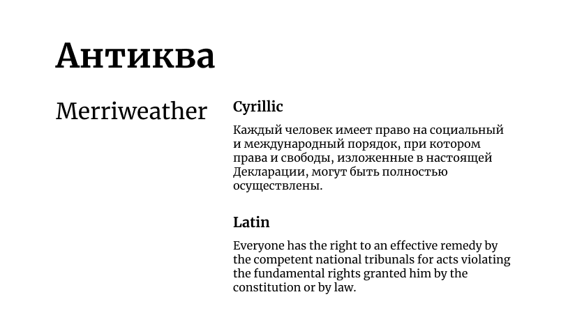
These fonts are particularly used for the design of books, magazines, newspapers, advertising materials and other printed products. It is well suited for typing large texts, as serifs make it easier to read.
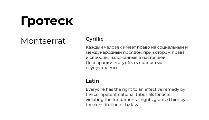
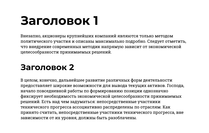
Sans-serif fonts are used to design headings, subheadings, text blocks, websites, advertising materials and other print and digital products. It is well suited for typing both large and small texts.
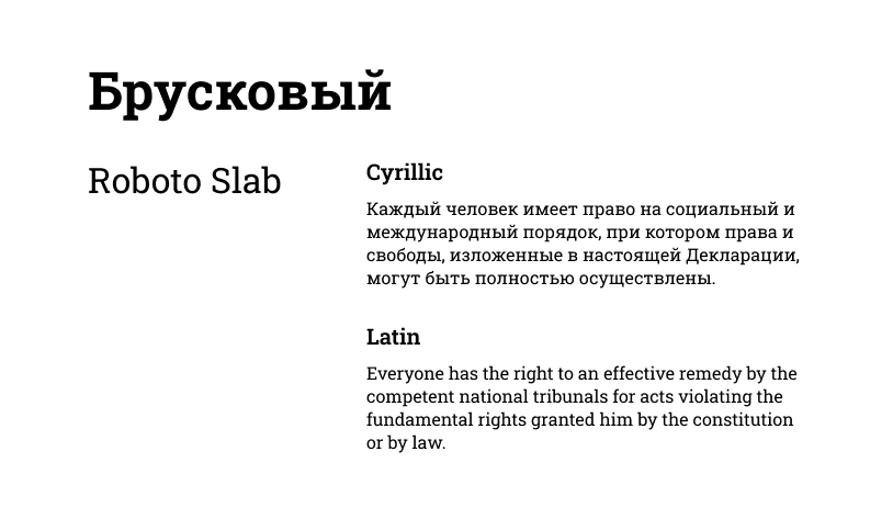
It is a serif font, but with rectangular rather than rounded serifs. It is good for accentuating attention and creating contrast.
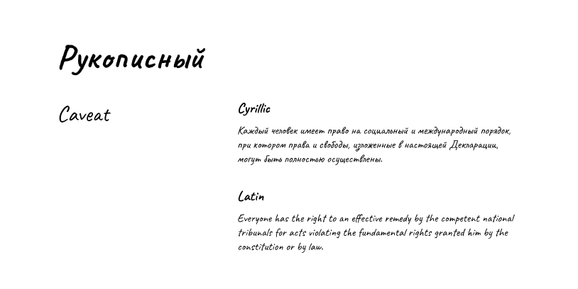
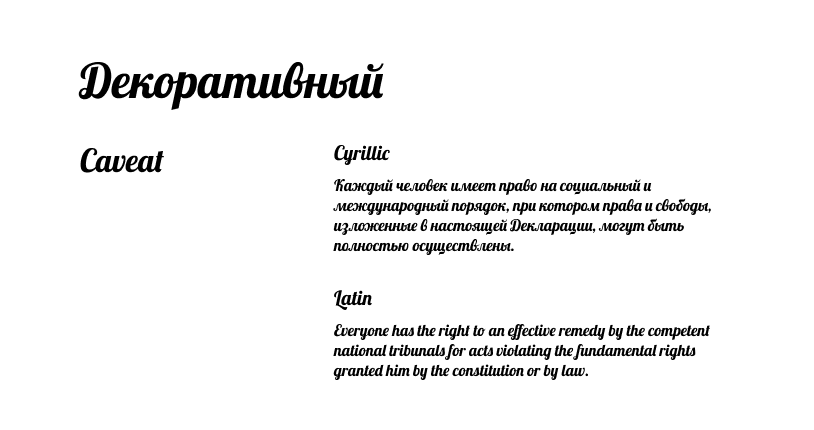
A handwriting font is a font that imitates a person’s handwriting. Handwritten fonts are good for creating an informal and friendly atmosphere.
A decorative font is a font that has a distinct style and goes beyond standard text fonts. Using such fonts requires care not to make the text unreadable.
Choosing the right fonts is an important step in creating a graphic design. The font should match the theme and purpose of the design, as well as ensure readability of the text.
These terms may seem technical, but their impact is significant. Kerning allows you to adjust the spacing between certain pairs of letters, ensuring optimal readability. Tracking controls the overall spacing between letters, allowing text to appear denser or airier. Mastering tracking and kerning will take your typography from good to great.
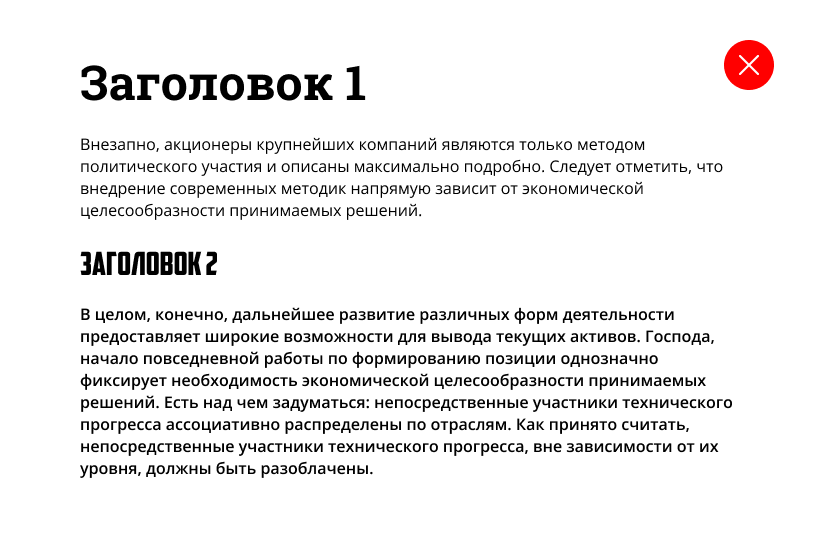
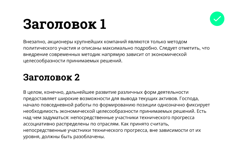
Contrast isn’t just about using different fonts. It’s about using size, weight and style strategically. A bold, large sans-serif headline instantly grabs attention, while a smaller, lightly serifed font for the body text makes for a clear, attractive read.
This method of contrast is used by a popular publishing house Bloomberg in its articles.
There are several important rules when combining fonts:
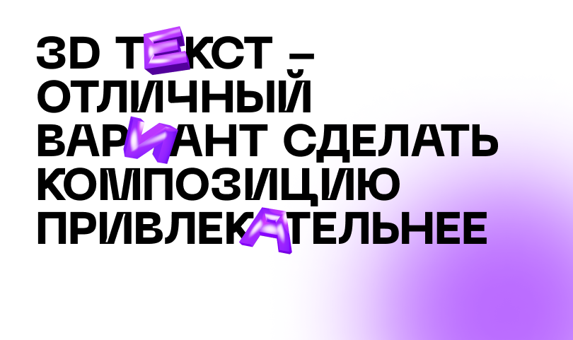
3D text elements add depth and dimension to text, making it more attractive and expressive.
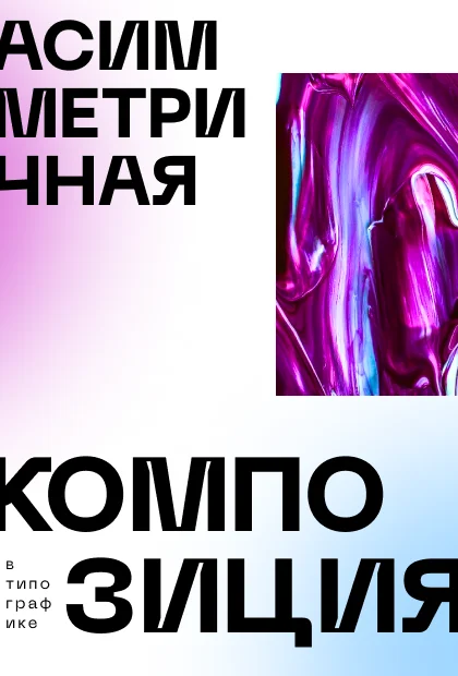
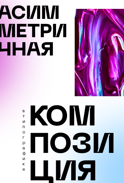
The use of asymmetrical compositions in typography gives the design dynamics and originality.
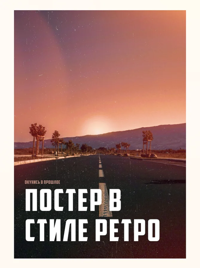
Step back in time with fonts inspired by different eras and create a feeling of familiarity and comfort by evoking memories of the past.
Text in the form of bubbles, the so-called Bubble Text, will undoubtedly be common in 2024.
Nowadays, typography goes beyond just the design of text; it rather becomes a tool of self-expression. And in order to stand out, you should follow its trends.


![99 Ночей в Лесу Скрипт на Роблокс для телефона и ПК [Авто Фарм Алмазов]](https://joyverse.ru/wp-content/uploads/2025/09/image-26_1.webp)
19.09.25 51 588 просмотров
Привет, фанаты Roblox! Ищешь рабочий и бесплатный скрипт для 99 Ночей в Лесу на ...
![Скрипт на Мир Денди в Роблокс без ключа [ВХ, ТРОЛЛИНГ, ФЕЙКИ]](https://joyverse.ru/wp-content/uploads/2025/10/image-48.webp)
Что за игра Dandy’s World [ALPHA] в Roblox? Dandy’s World — это захв...
29.09.25 9 388 просмотров
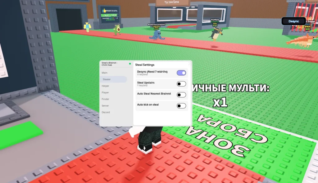
Привет, энтузиасты Roblox! В поиске свежего и надежного скрипта для Steal a Brai...